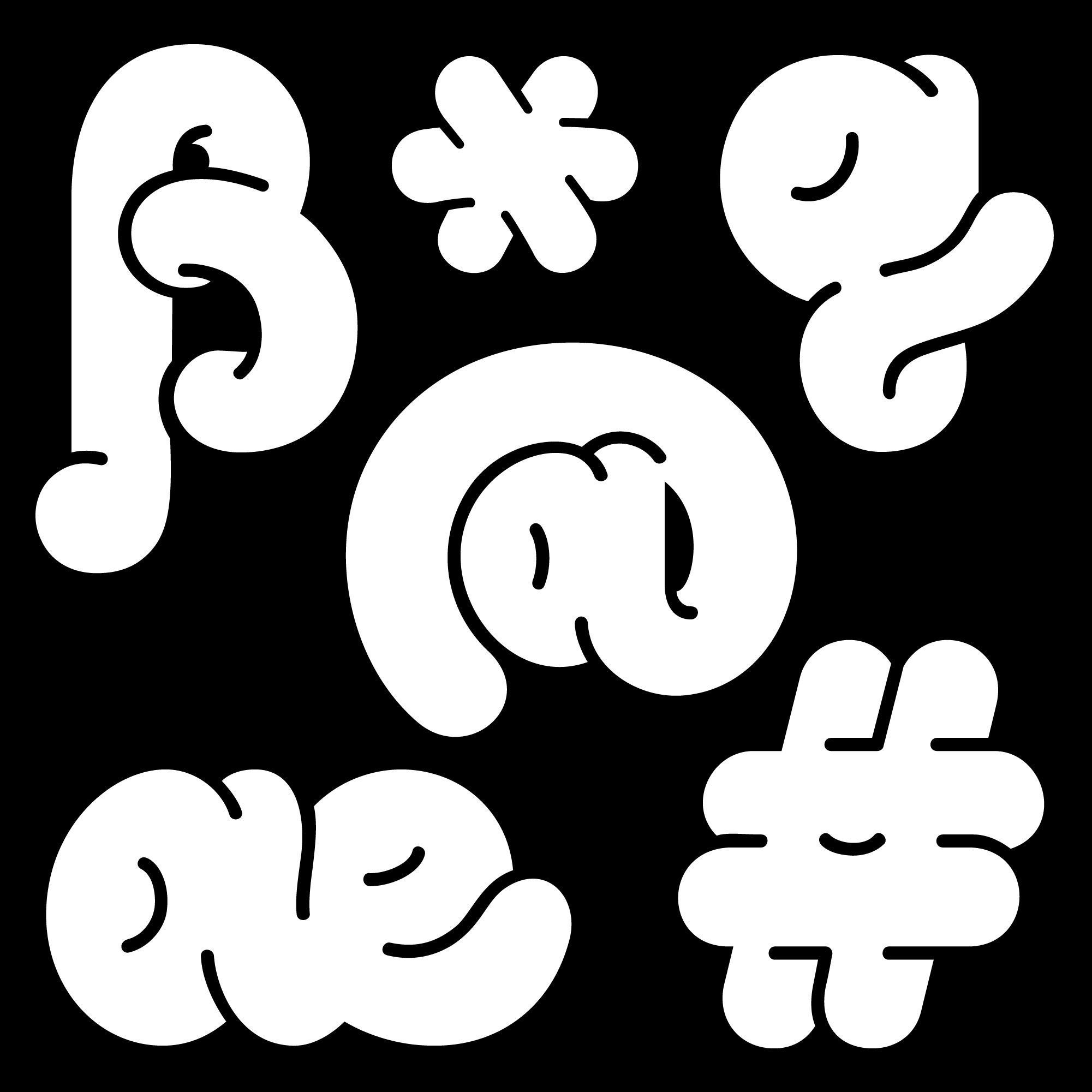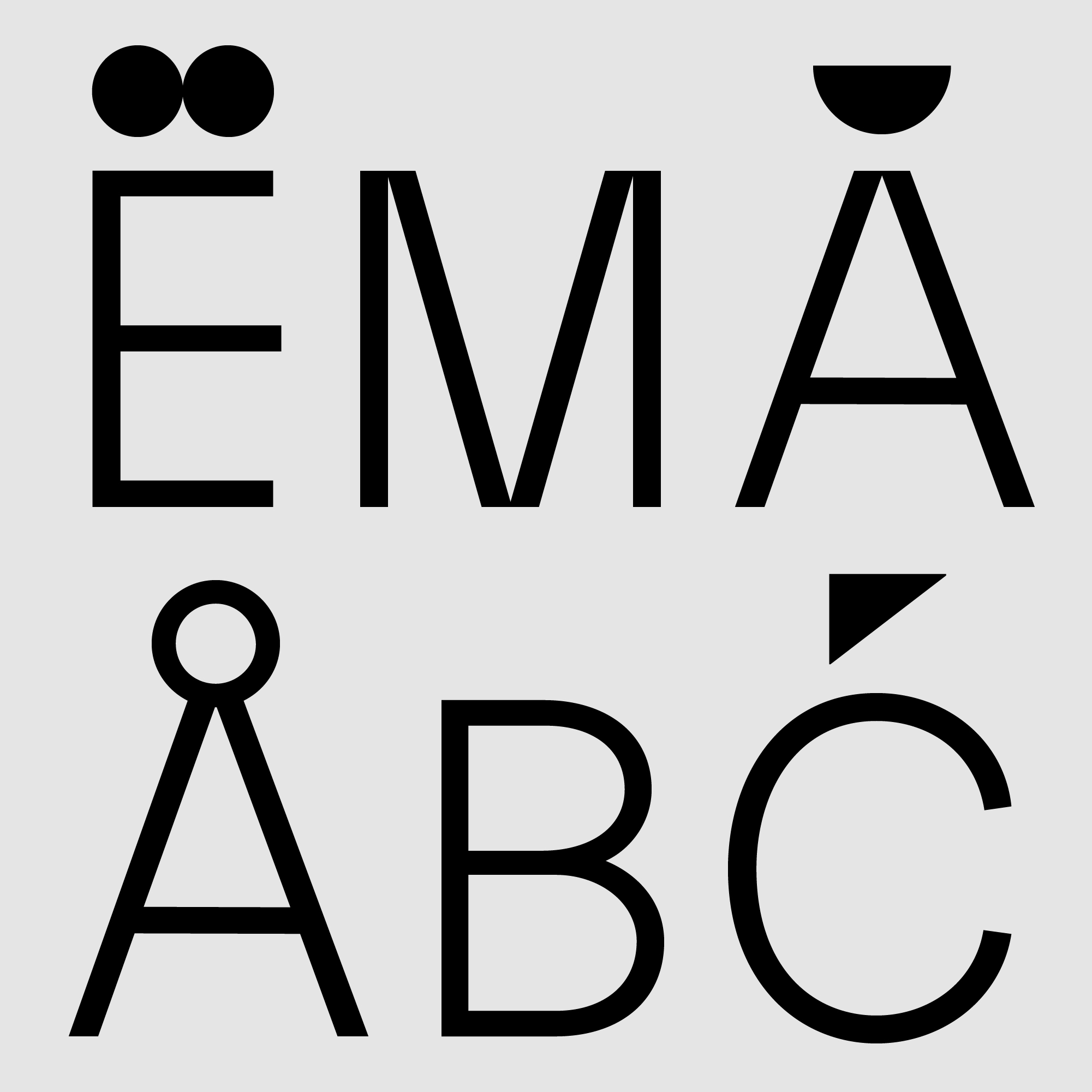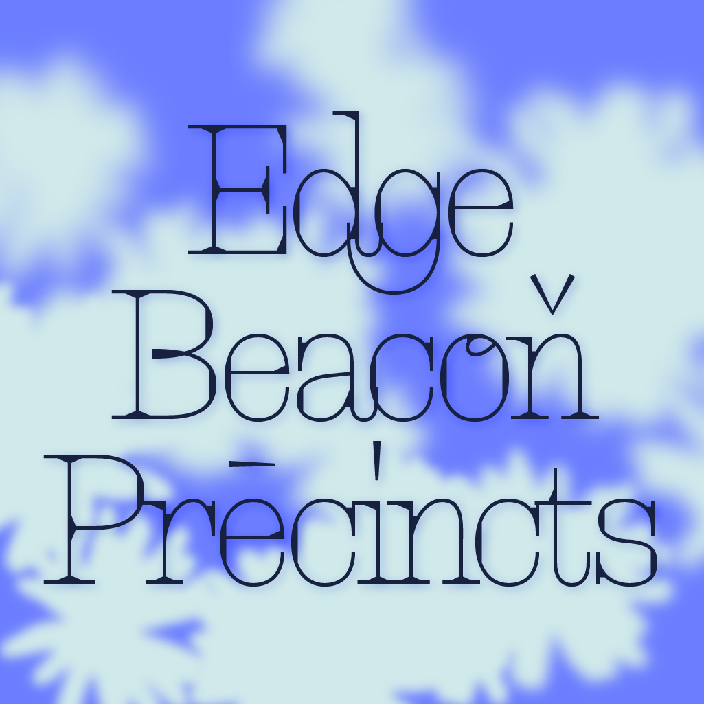
Antonym Display.
Antonym is a typeface that explores the interplay of connection and contrast through thin, long lines with elegant tails, emphasizing intersections, ligatures, and rich black spaces resembling pooled ink.
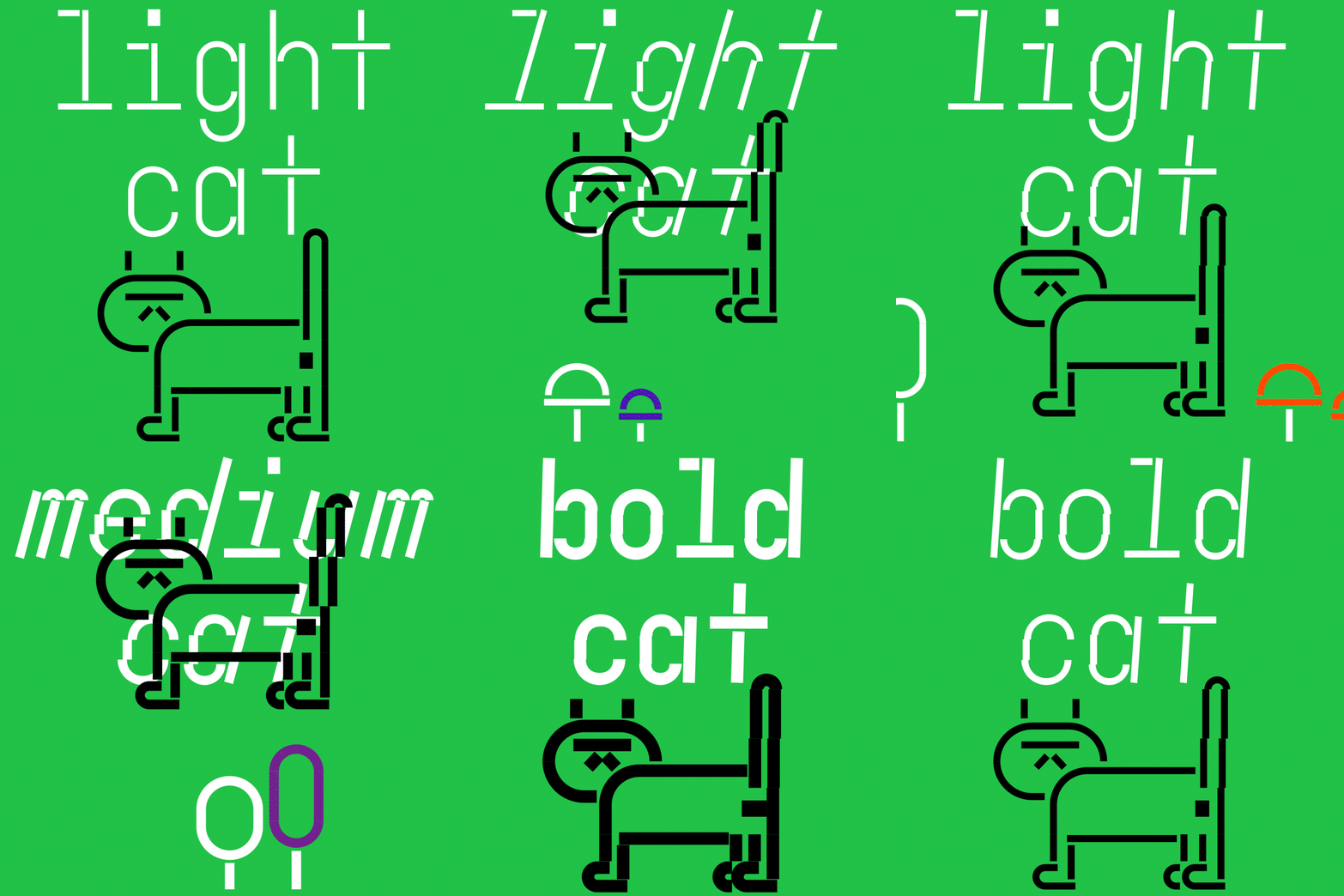
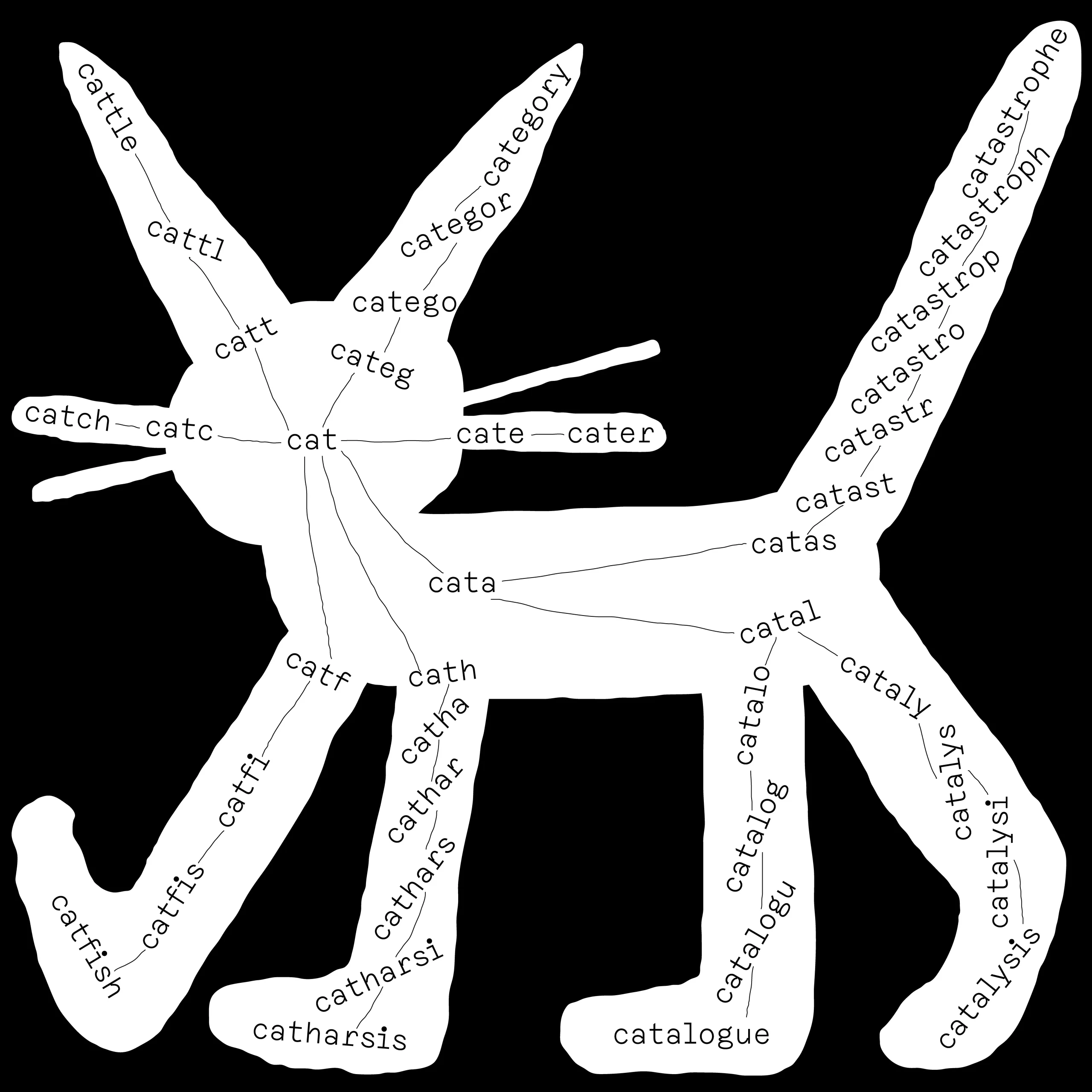
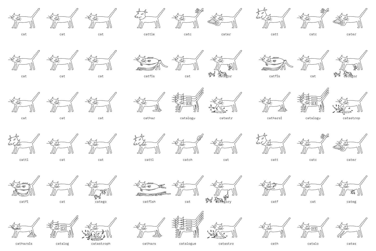
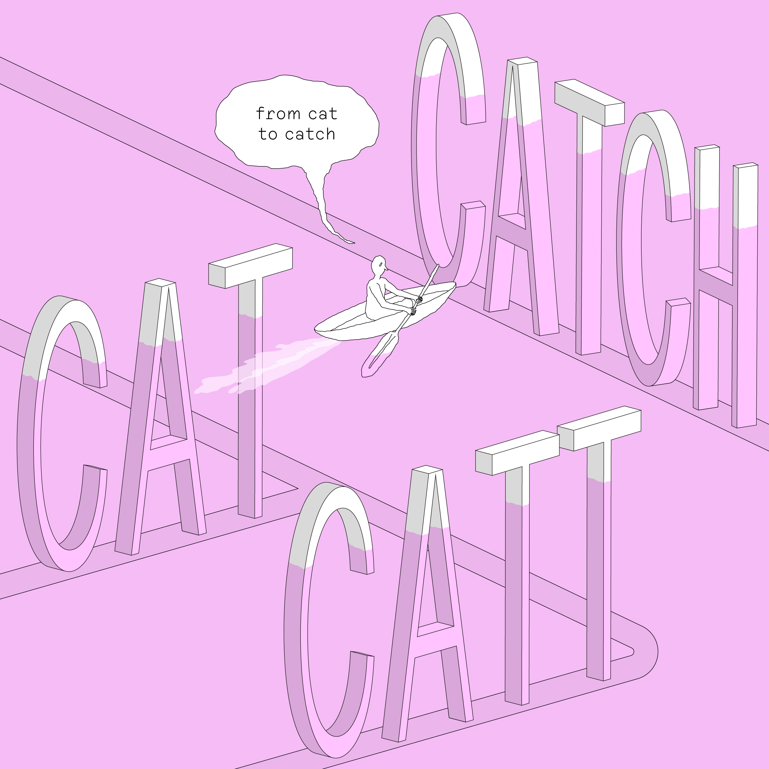
Upgrading Cat (feat. Domino Mono)
Light Cat -> Medium Cat -> Bold Cat
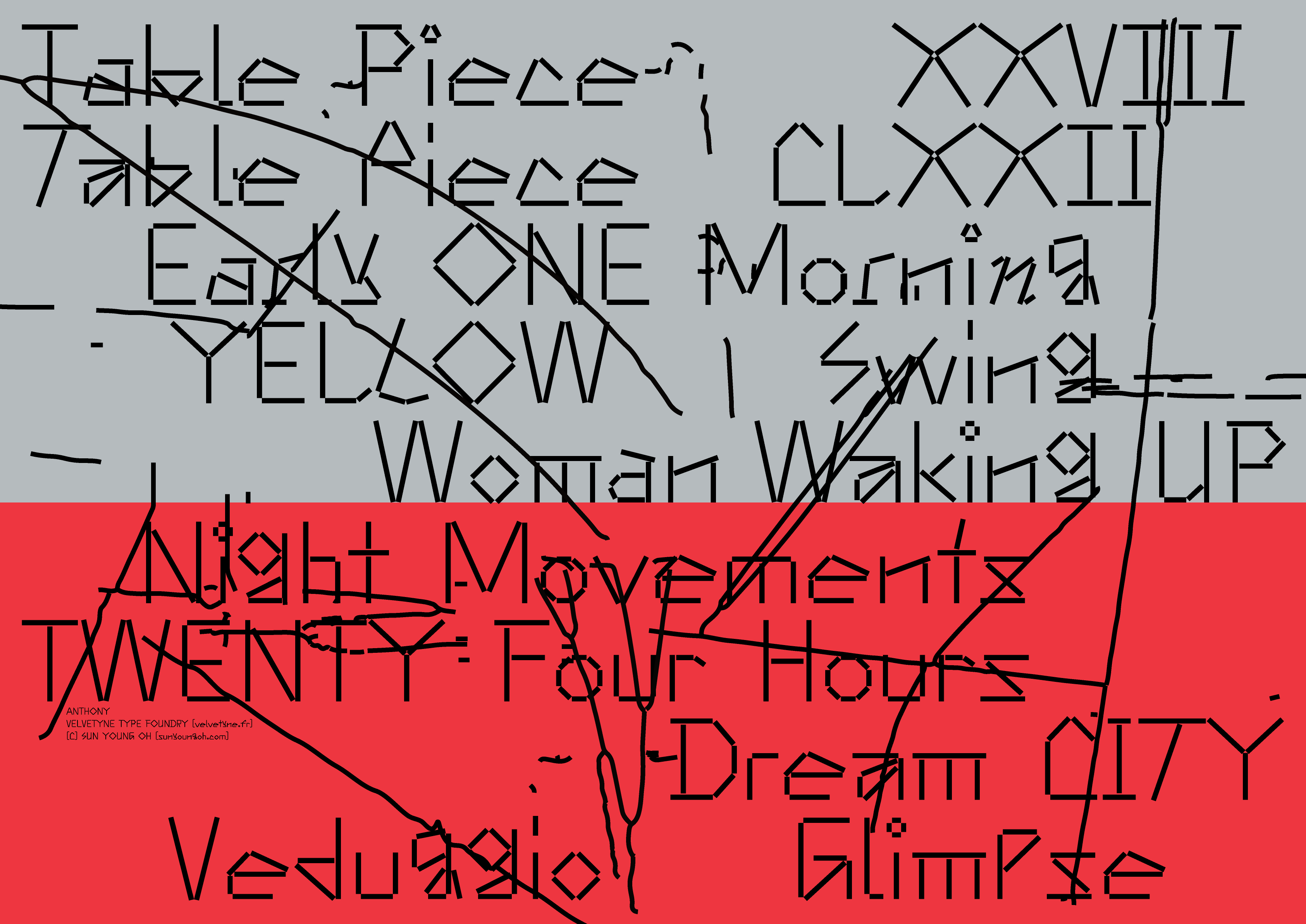
The Anthony specimen poster is on display at Poster House in NYC.
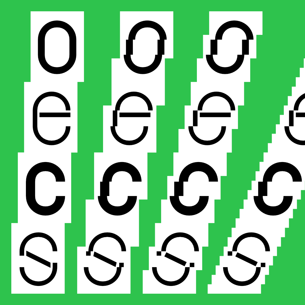
Domino Mono – monospaced variable typeface inspired by the visual trace of toppling dominoes.
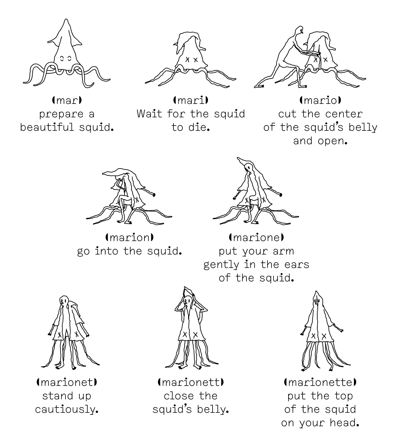
How to wear a Squid?
Flefixx is an idiosyncratic visual language and typeface system that finds and creates narratives based on common combinations of letters.
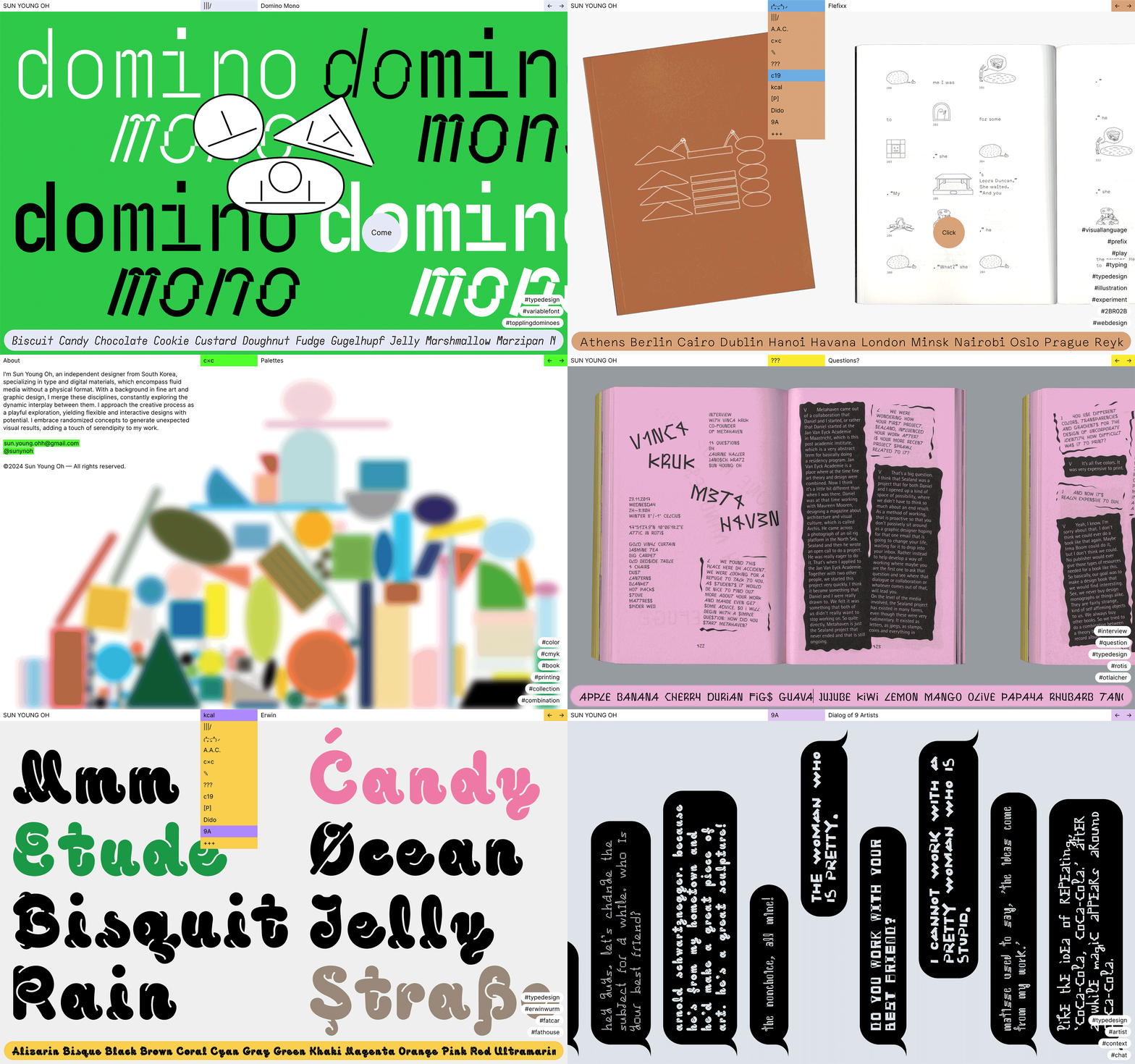
My portfolio website in 2023 version.
Designed a compact & compatible wireframe for all type of project, for presenting one project by one page.
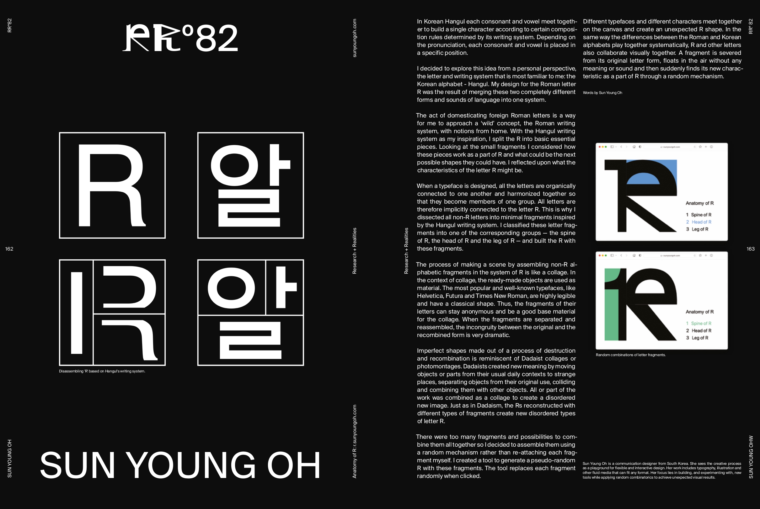
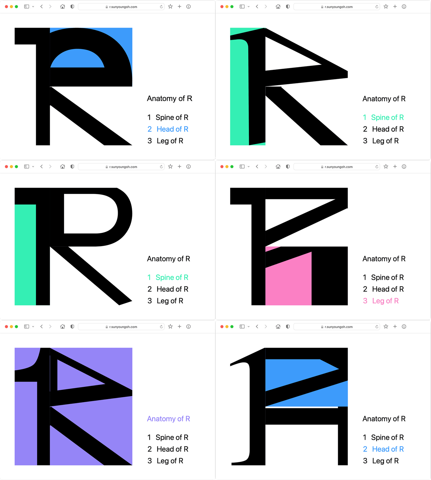
Designed letter “R” for Research & Realities in DAMN Magazine No.82 “Radical Domesticity”.
Disassembling “R” based on Hangul’s writing system.
Idiosyncratic word pruning.
Metaphorical explanation with floods.
Inspired from the text “Paris was not flooded” by Roland Barthes.
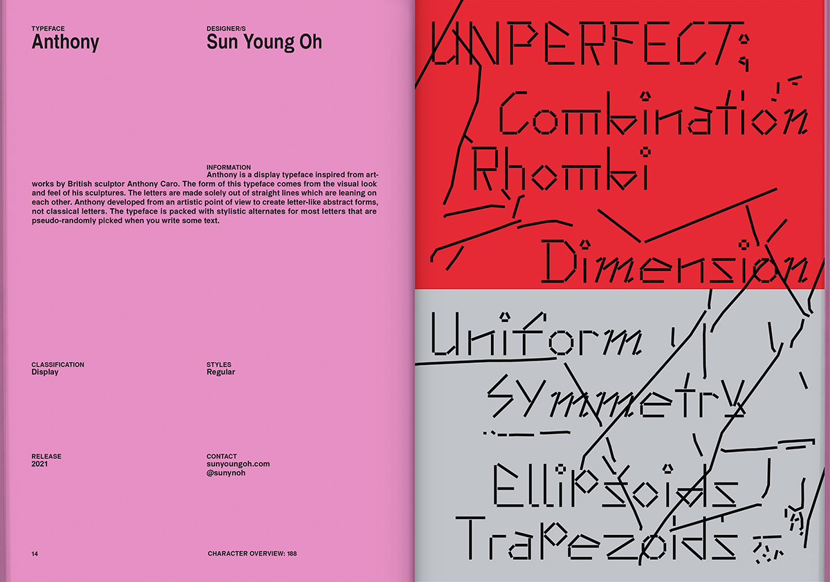
Anthony is featured in “New Aesthetics 3”.
A publication edited by Leonhard Laupichler & Sophia Brinkgerd.
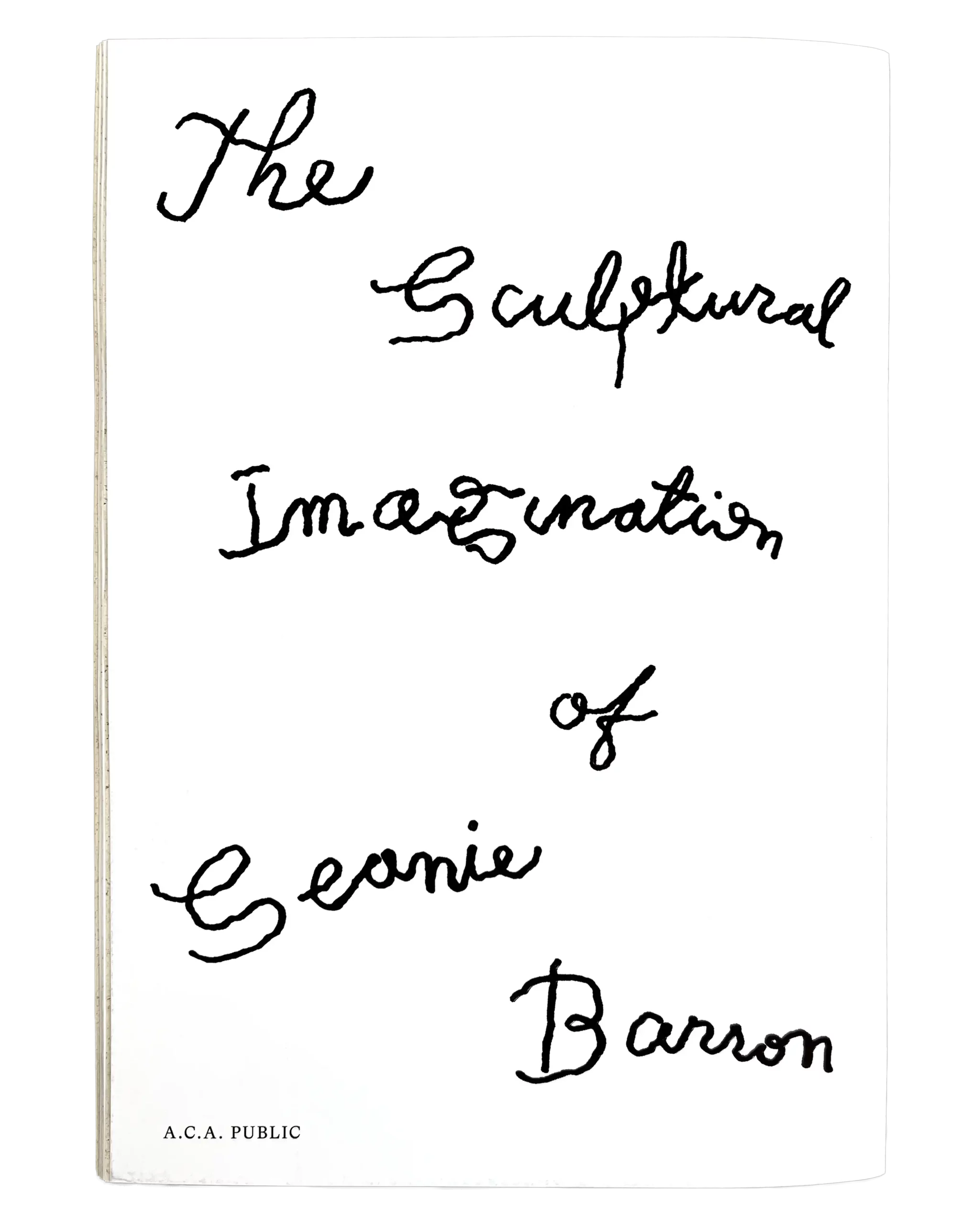
Cover lettering for “The Sculptural Imagination of Seanie Barron”
Book Design by Daly & Lyon
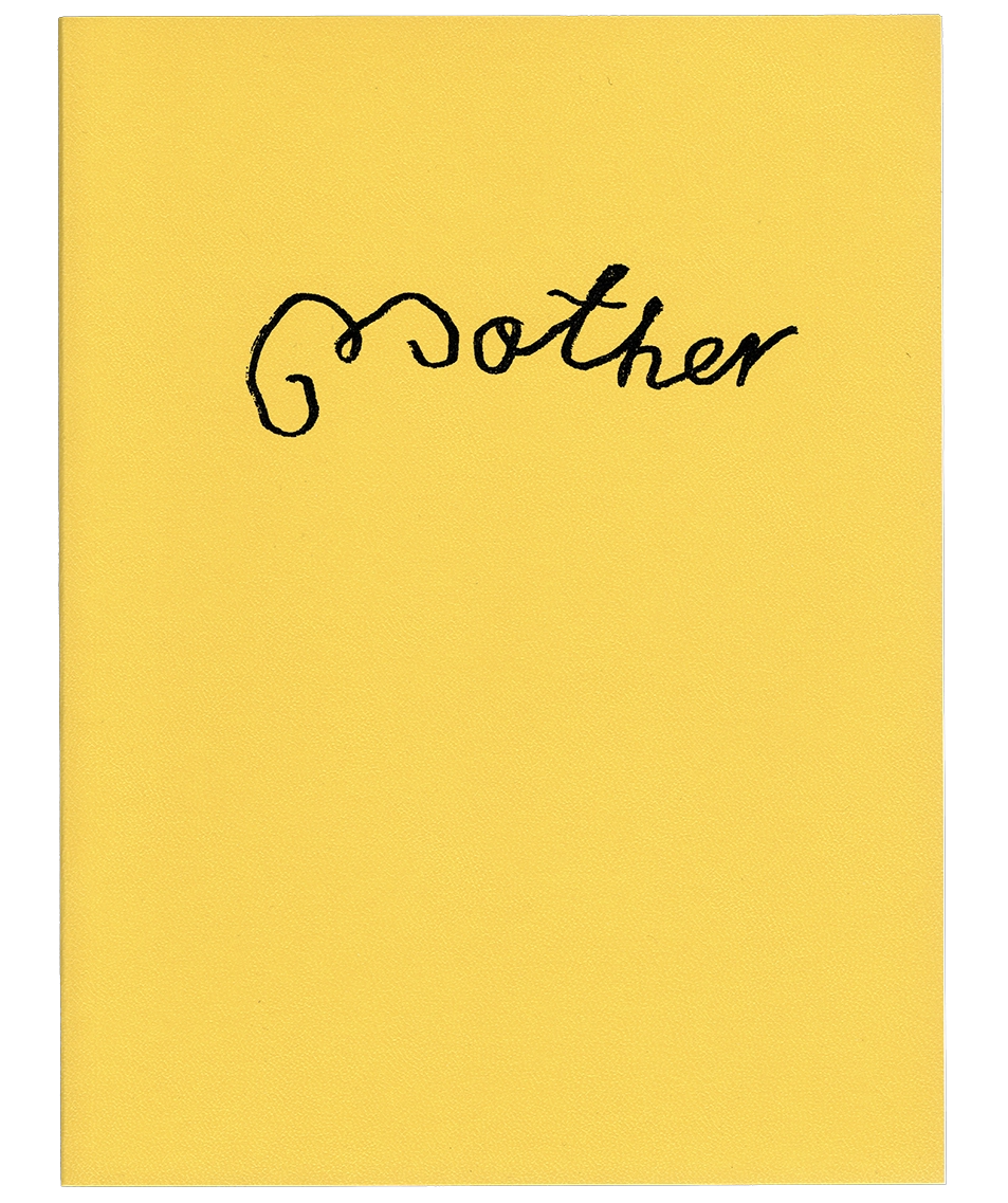
Cover Lettering for “Mother” by Adrian Samson.
Book Design by James Langdon.
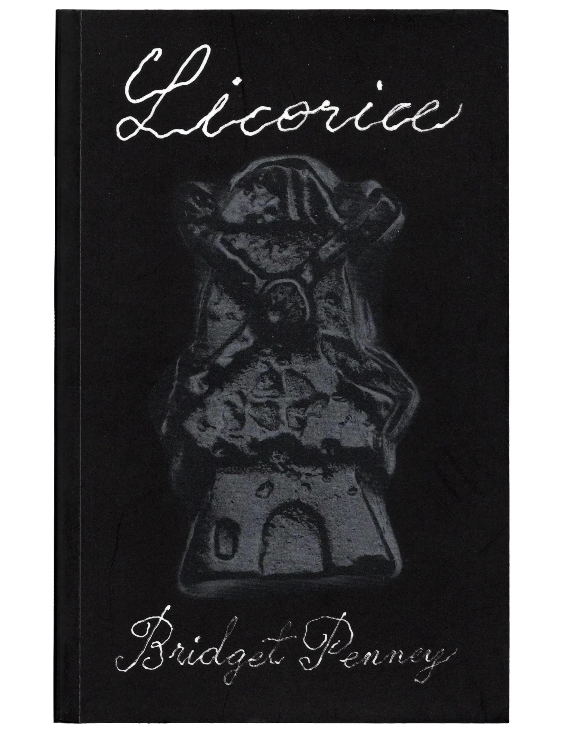
Cover Lettering for “Licorice” by “Bridget Penny”
Book Design by James Langdon
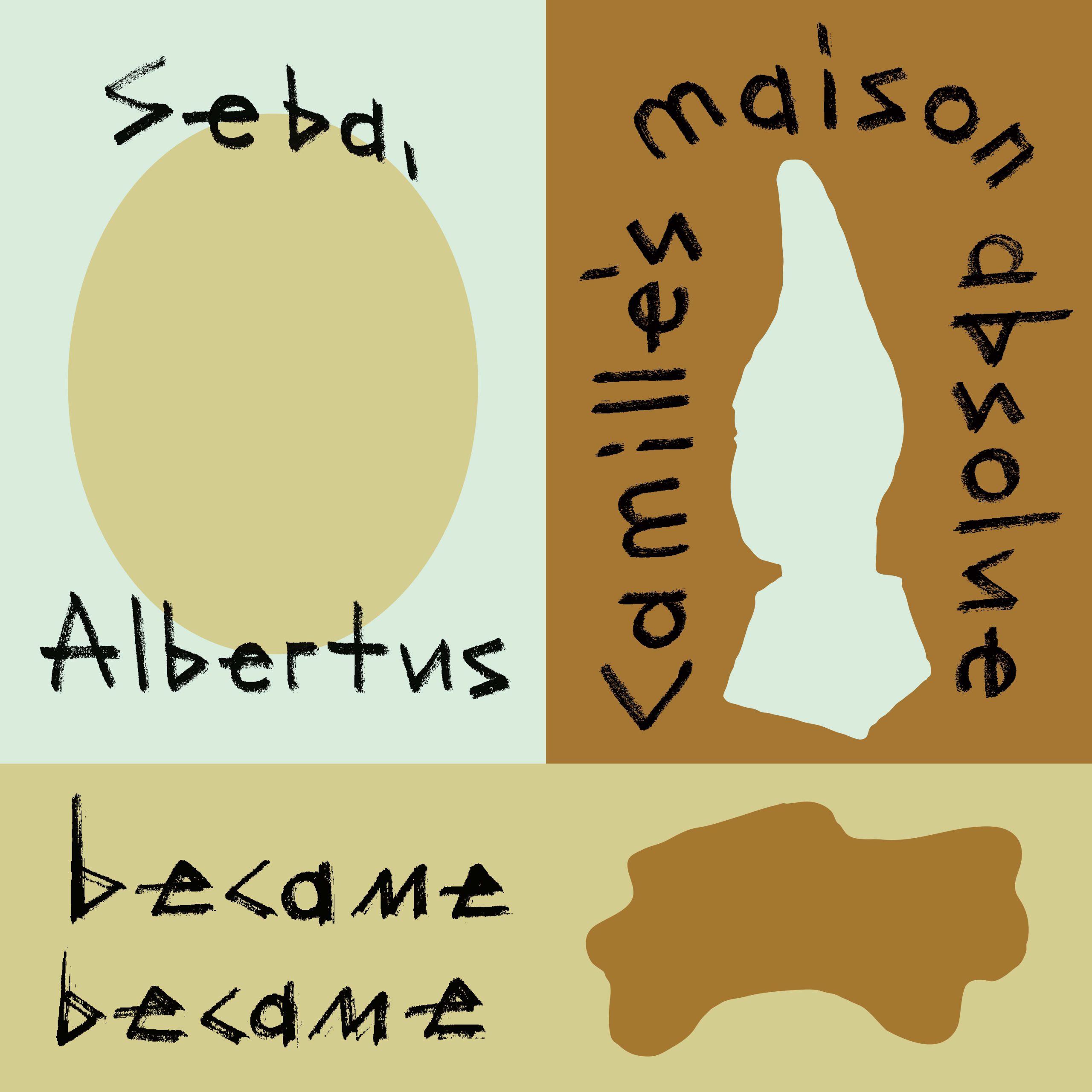
Unrealized Lettering.
Commissioned by James Langdon.
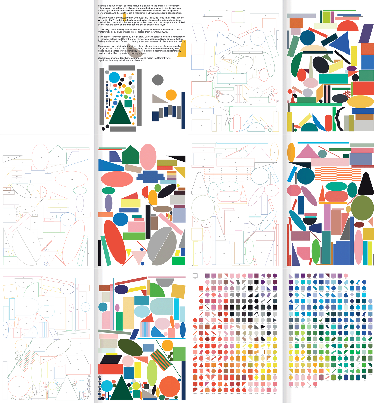
Palettes – featuring 492 colors in 7 palettes.
Collecting colors from images using an eyedropper in CMYK to create my own color book.
Combining colors in various forms adds a unique character to each color.
Printed by G . F Smith.
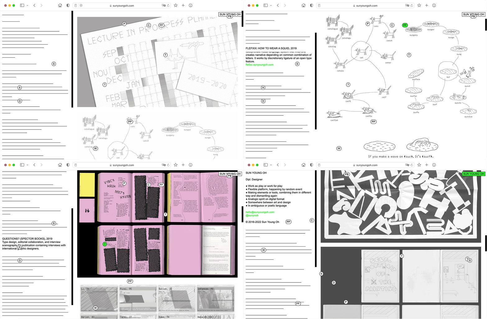
Designed and developed My Website, 2019 version.
Treasure hunting concept.
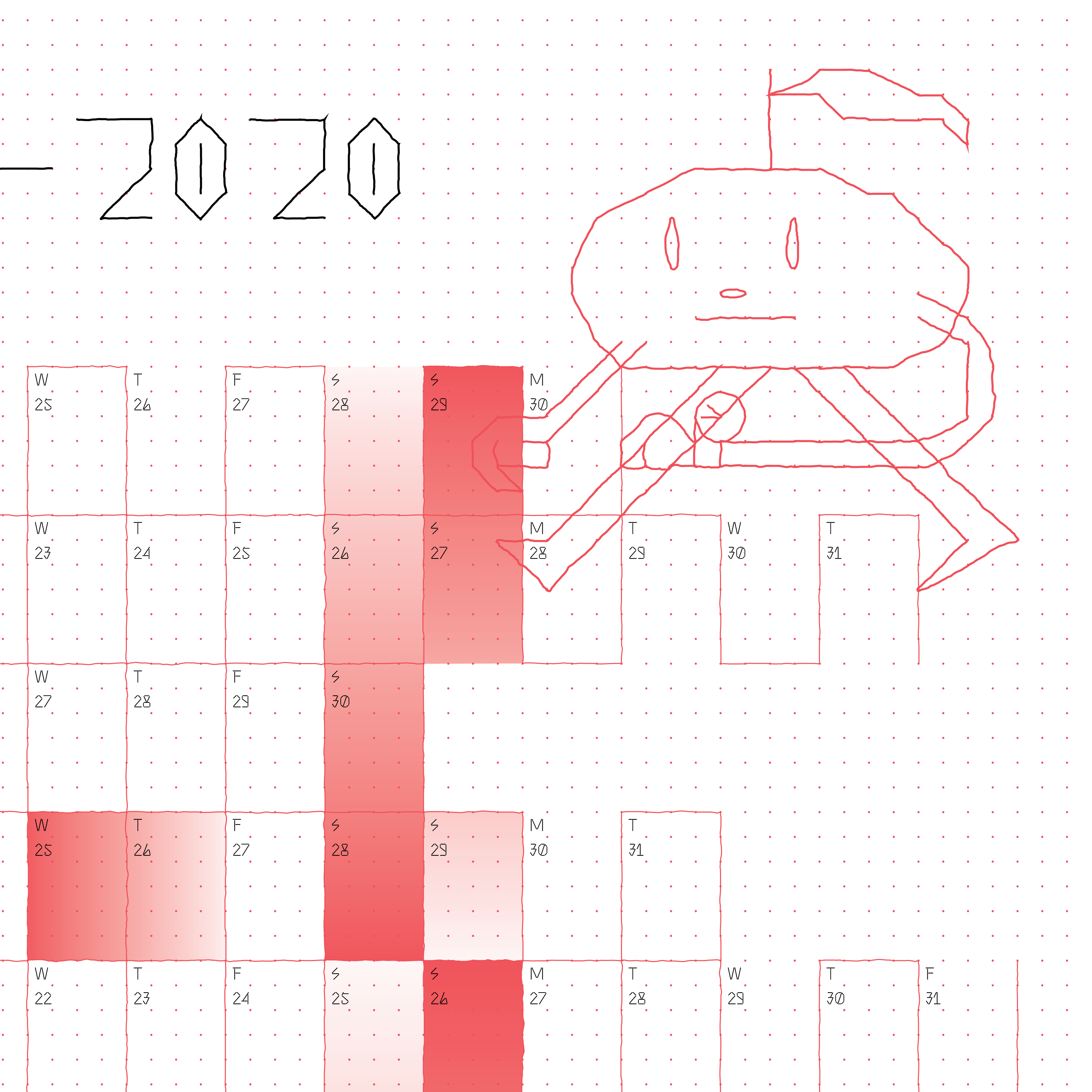
Designed the Academic Year Planner 2019-20.
Commissioned by Creative Lives In Progress.
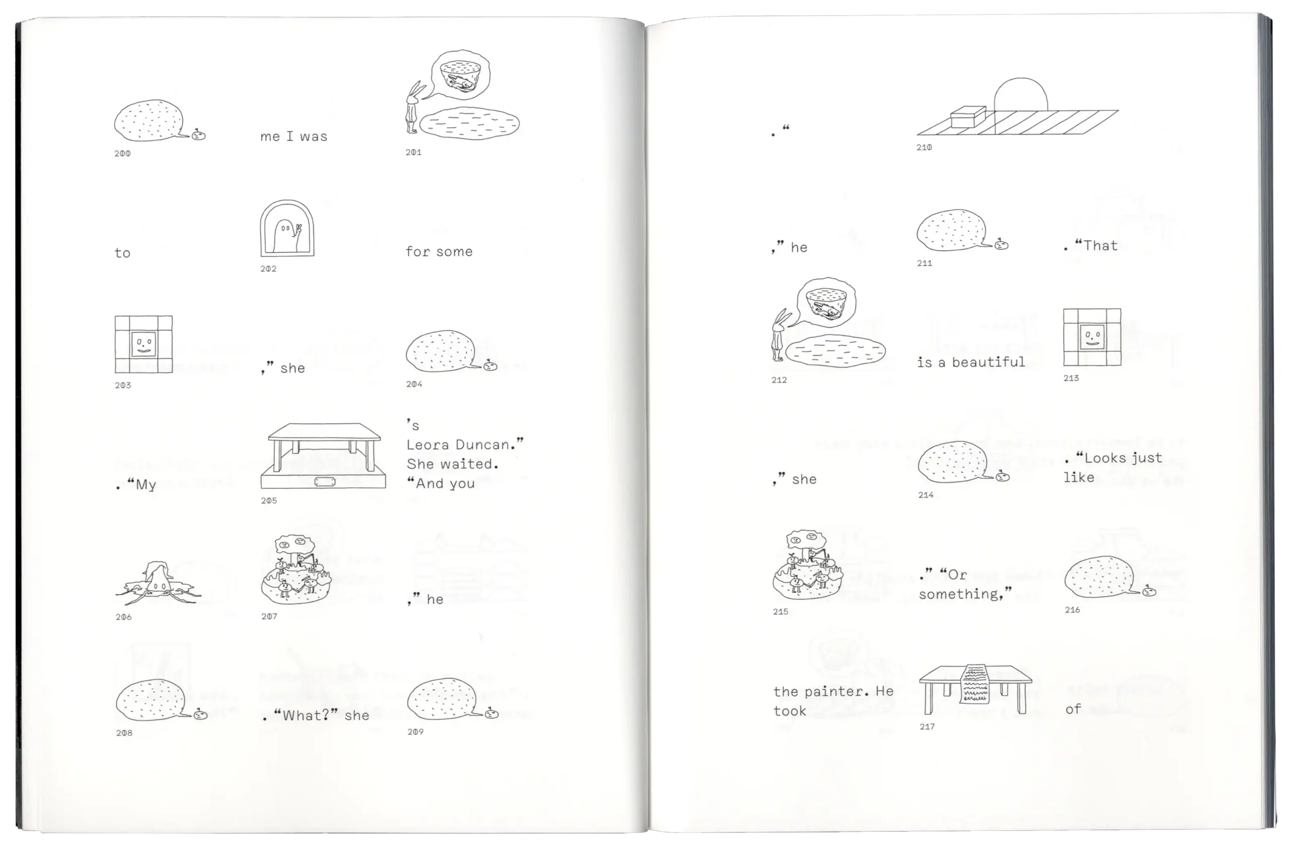
The Flefixx typeface was used to generate a pictorial translation of the story “2BR02B” by Kurt Vonnegut.
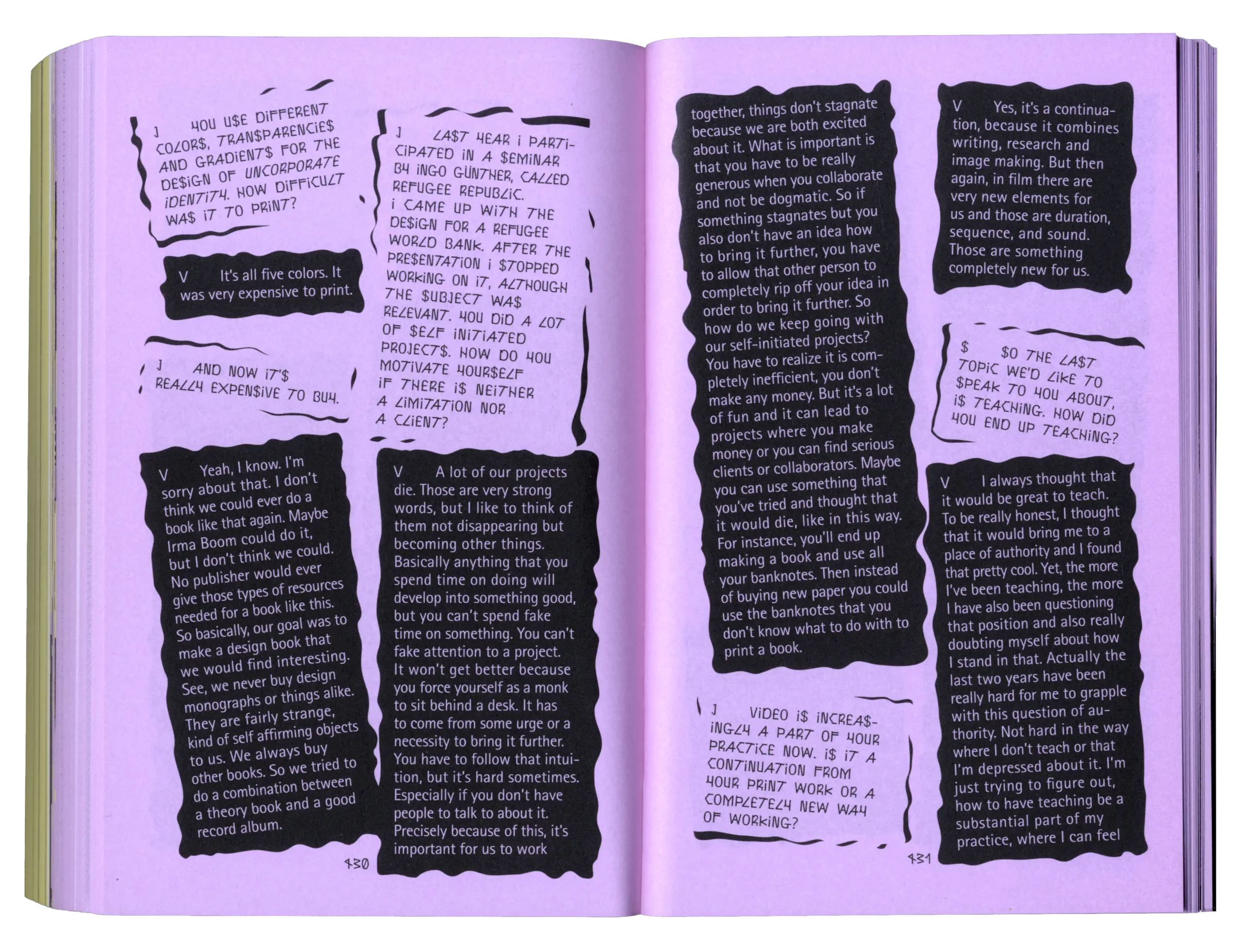
Interview with Vinca Kruk (Metahaven).
Type design, editorial collaboration, and interview scenography for publication containing interviews with international graphic designers.
With Laurine Haller & Janosch Kratz.
Edited by David Bennewith & Sereina Rothenberger.
Book Design by Simon Knebl, Béla Meiers, Friederike Spielmannleitner.
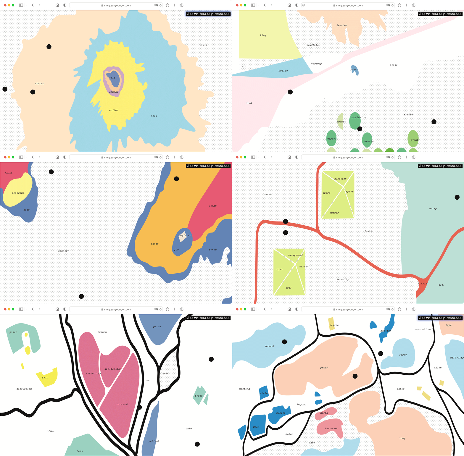
A tool that generates non-linear stories in a random way, with a group of words spreading on a graphic map.
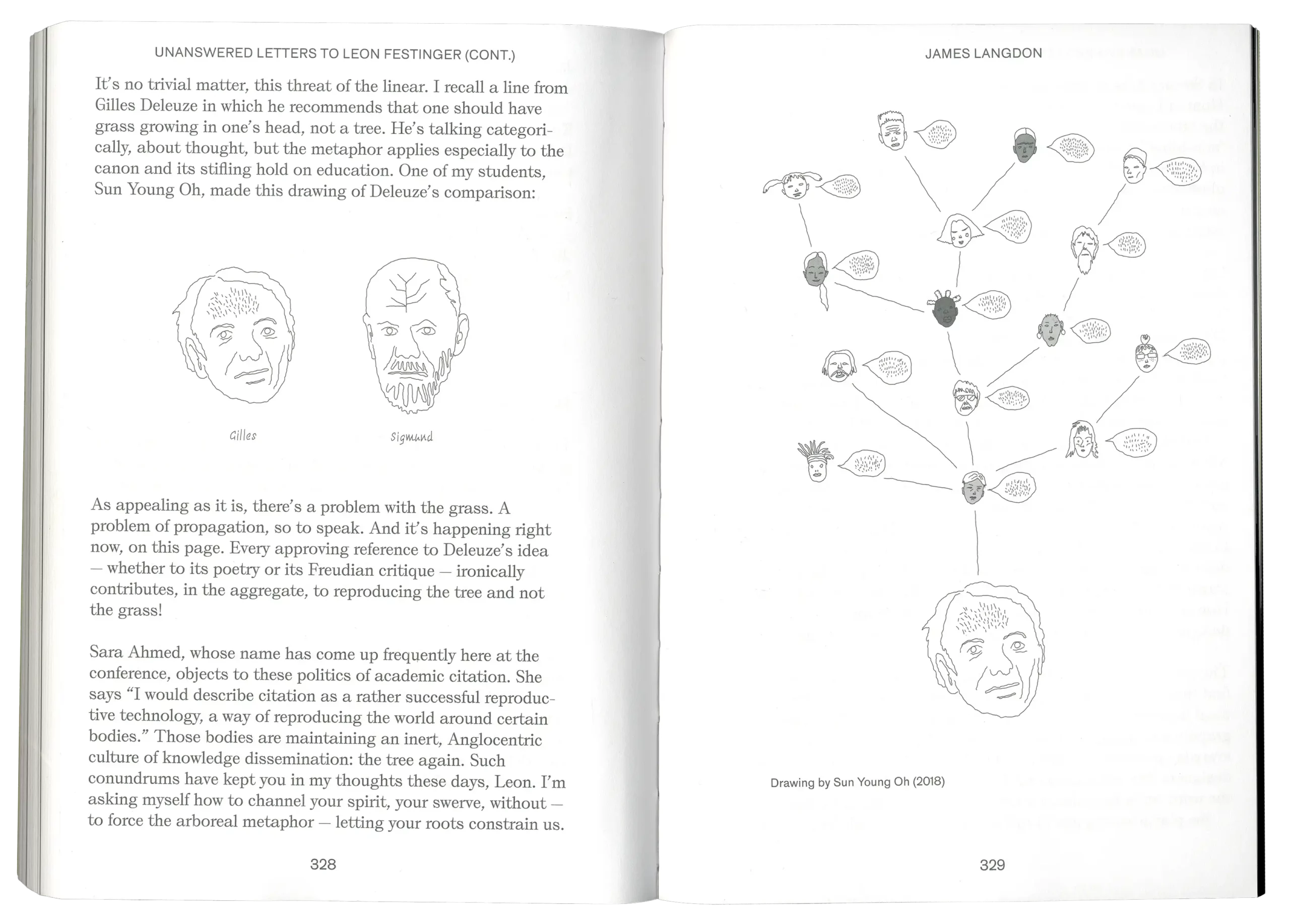
Drawing for the text “Unanswered Letters to Leon Festinger (cont.)” by James Langdon.
Onomatopee 163, Extra-Curricular.
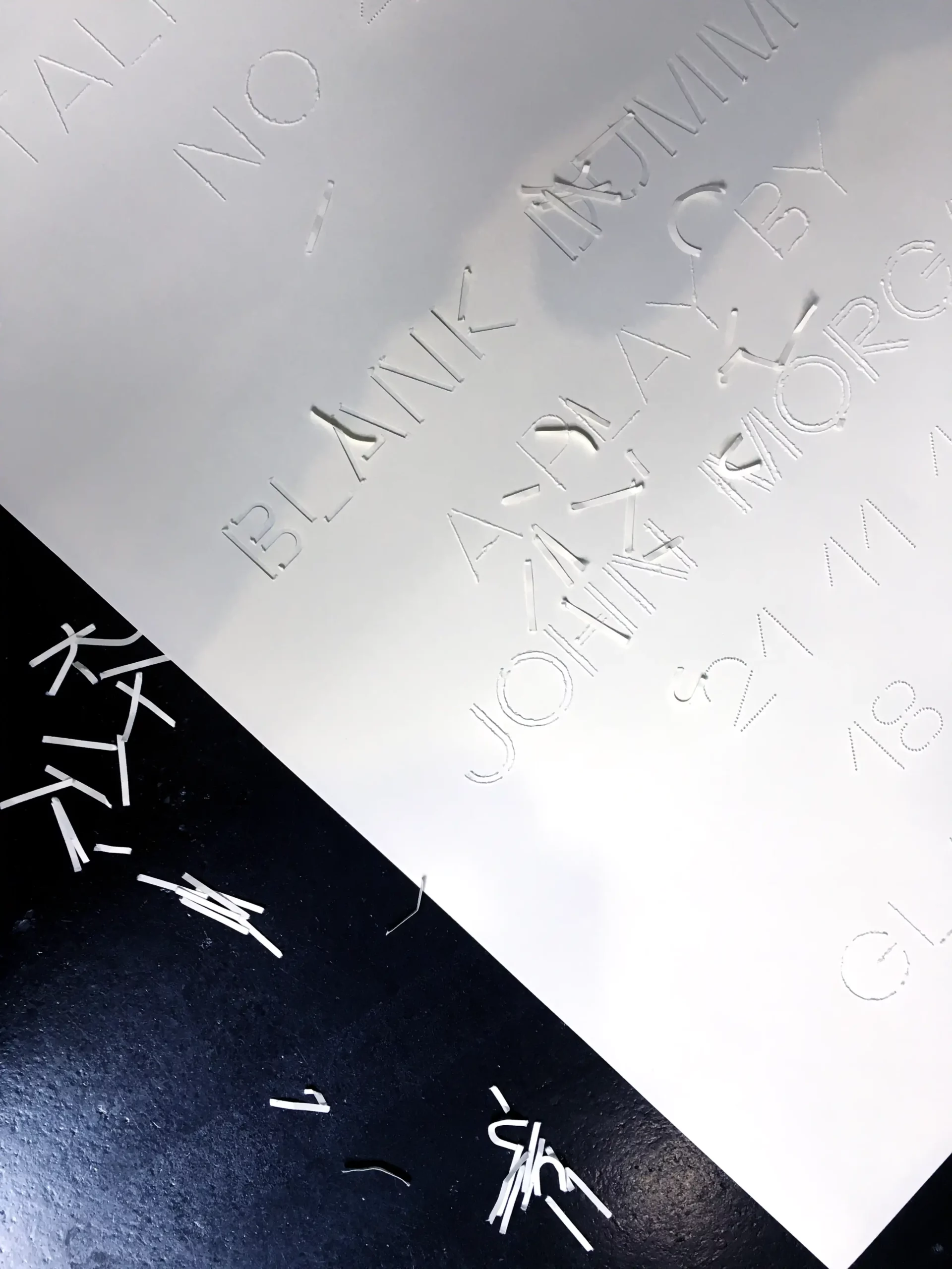
Poster design for Talk Show No.40 “Blank Dummy” by John Morgan at HfG Karlsruhe.
No print, No color.
Together with Severin Geißler.
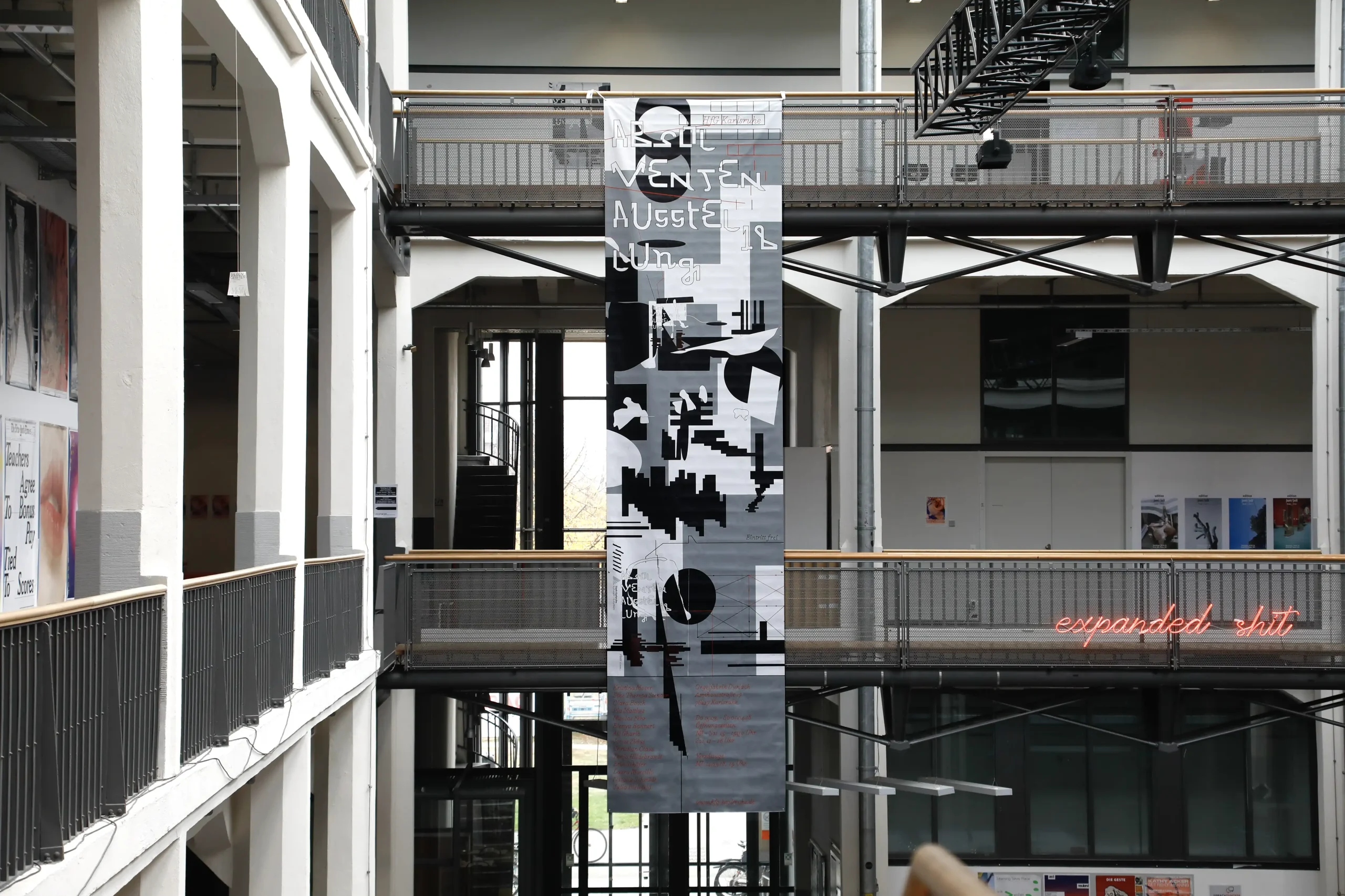
Designed Graphic Identity for the Graduate Exhibition in the Orgel Factory in Karlsruhe-Durlach.
Collaboration with Laurine Haller.
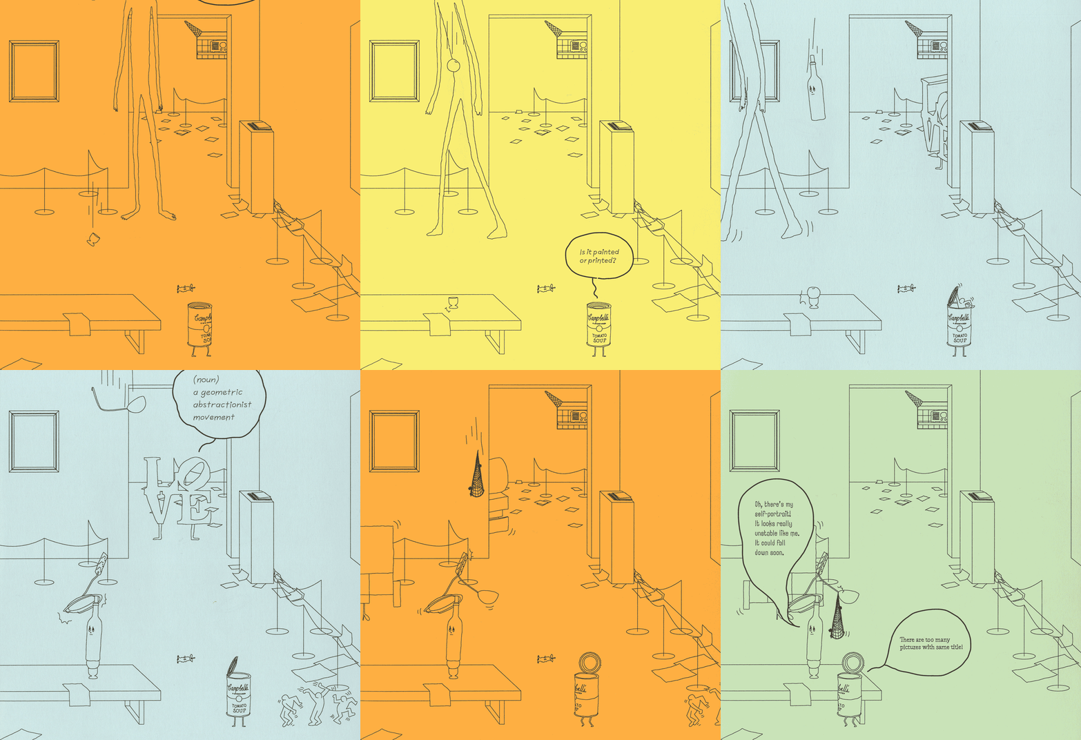
Self-Portrait of the Painting – A day in the museum seen from the perspective of a painting.
Result from the seminar by Henrik Schrat.
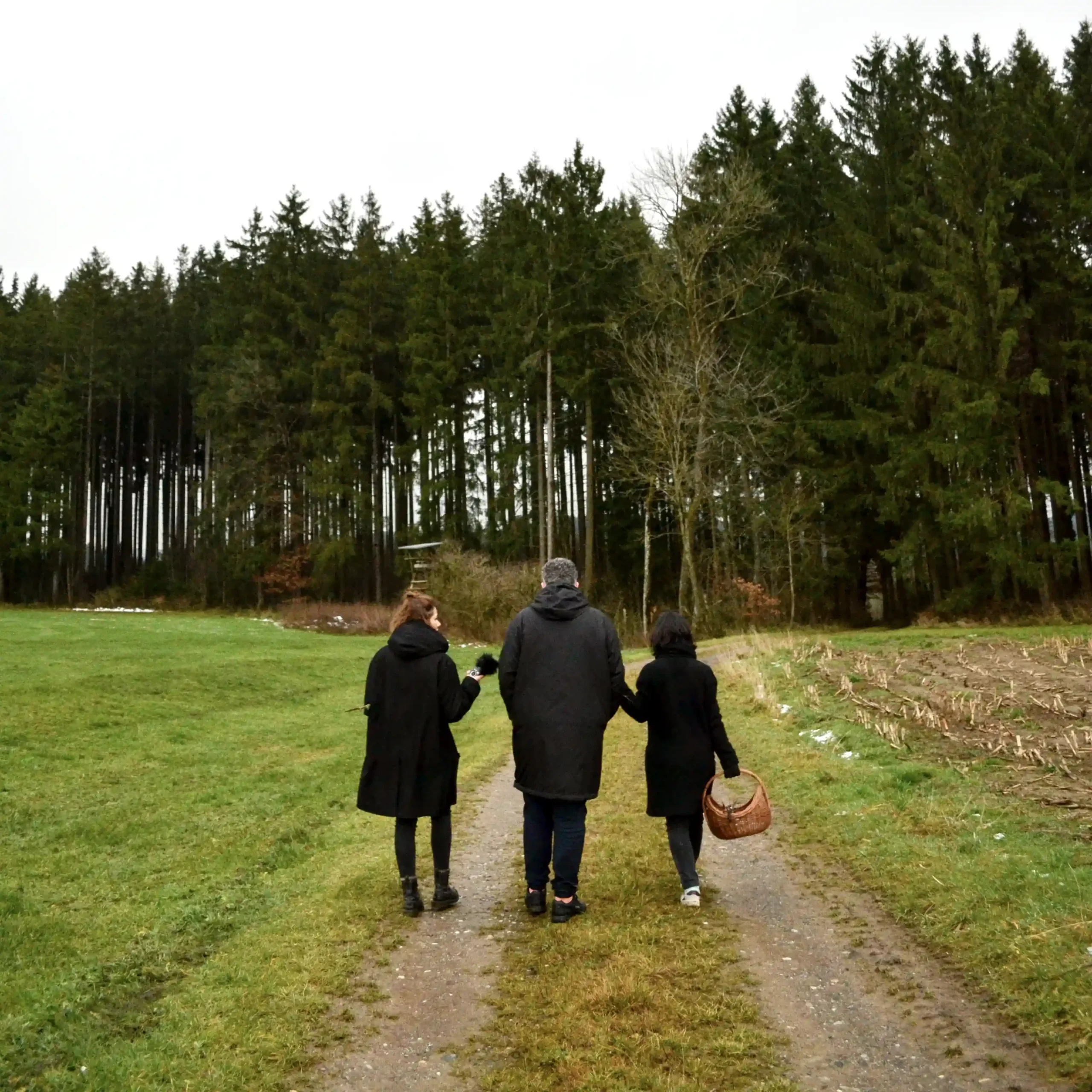
Questions – Interviewing, collecting mushrooms and herbs with Wayne Daly.
At Institut für analoge Studien in Rotis.
With Laurine Haller & Janosch Kratz.
Seminar by Sereina Rothenberger & David Bennewith.
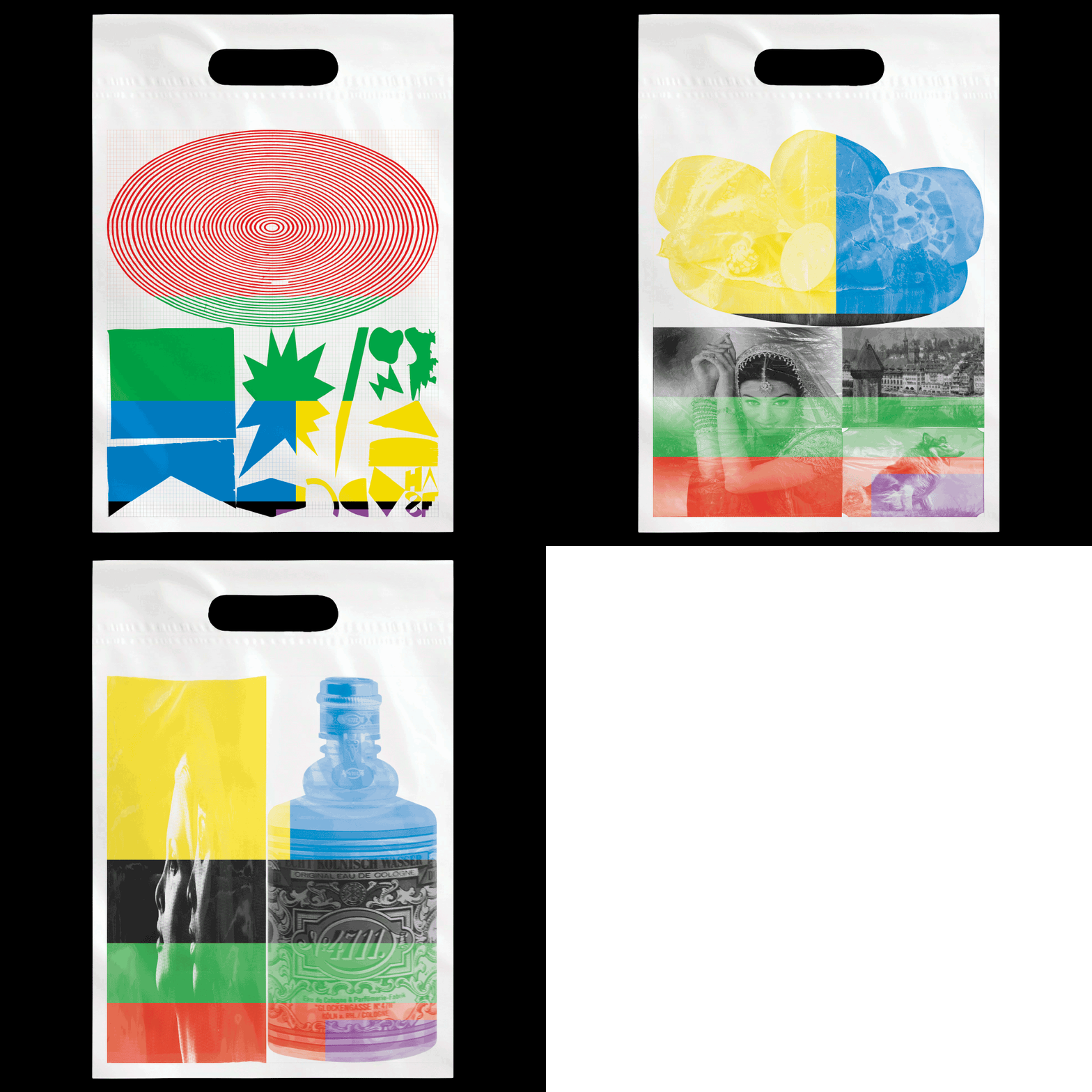
Categorizing and finding a way to archive over 100 plastic bags based on color, shape, and theme.
Result from a workshop by James Langdon & Juliane Hohlbaum.
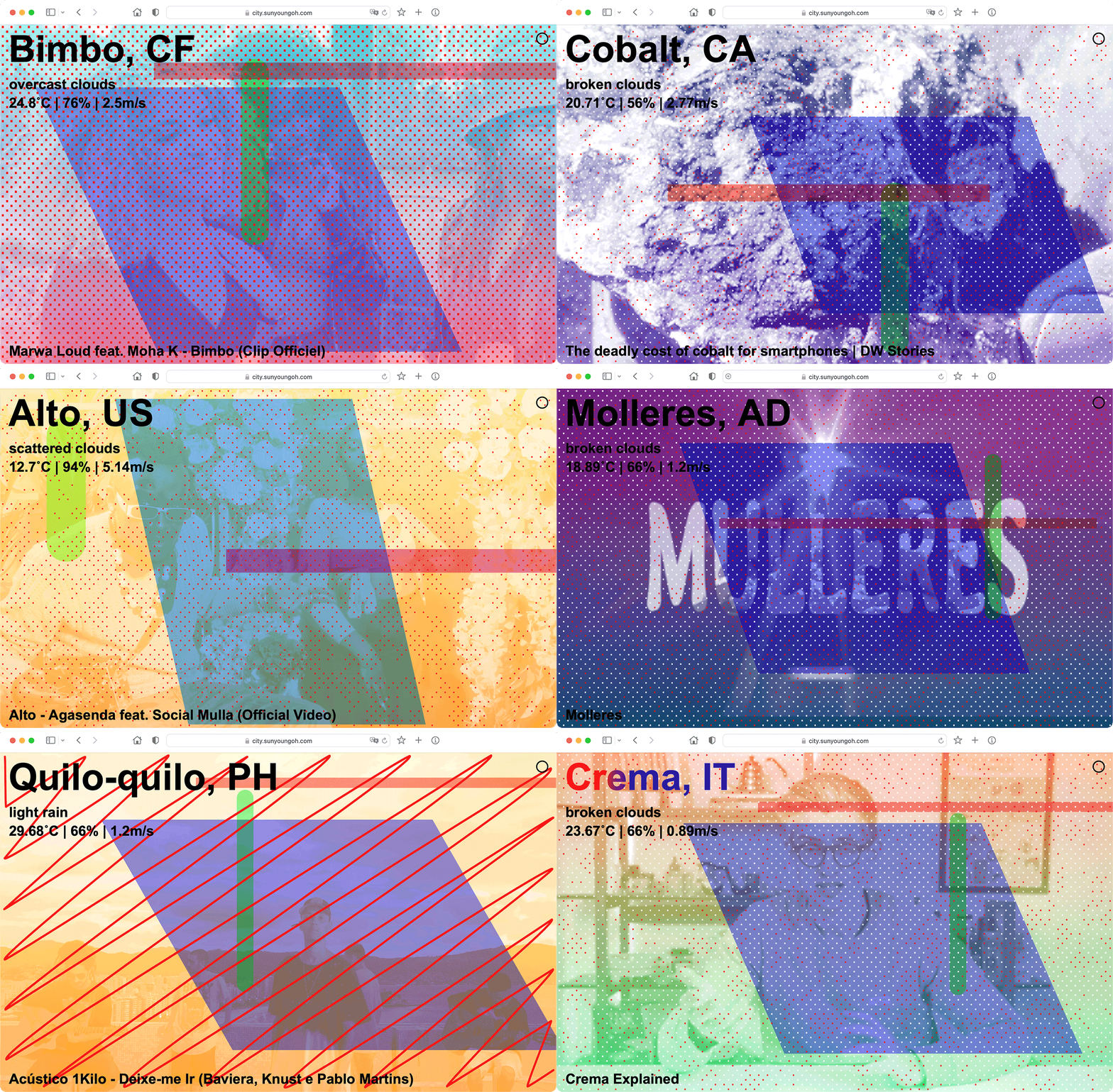
Website for generating abstract city portraits by scraping data and content from Youtube, Sound Cloud, Google Map, and Open Weather Map.
From seminar by Johnson / Kingston.
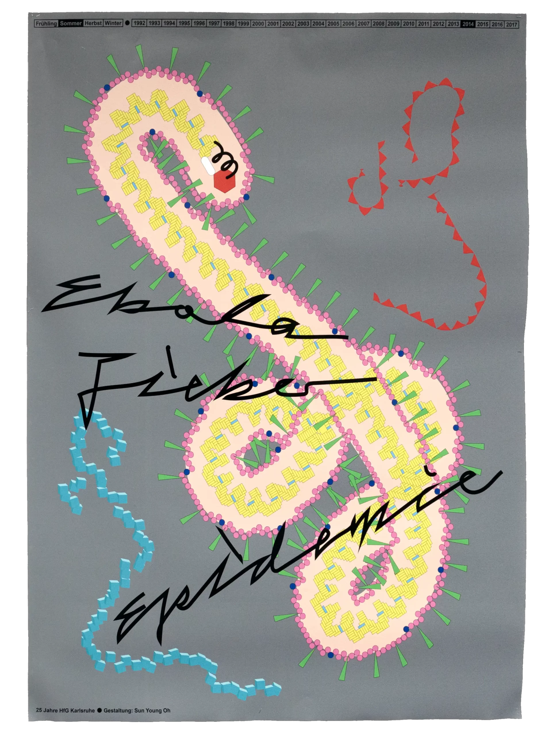
Poster for 25 Years HfG Karlsruhe.
Focused on the theme of the summer of 2014.
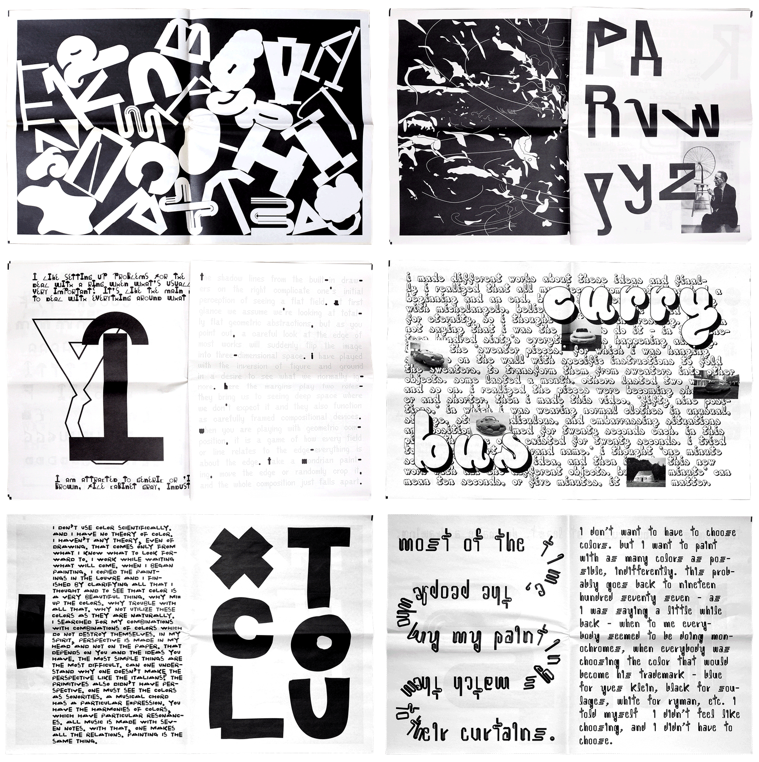
Dialog of 9 Artists.
Nine Typefaces, as Portraits of Artists – Anthony Caro, Bernard Frize, Erwin Wurm, Henri Matisse, Julie Mehretu, Marcel Duchamp, Rachel Whiteread, Robert Mangold, and Uta Barth.
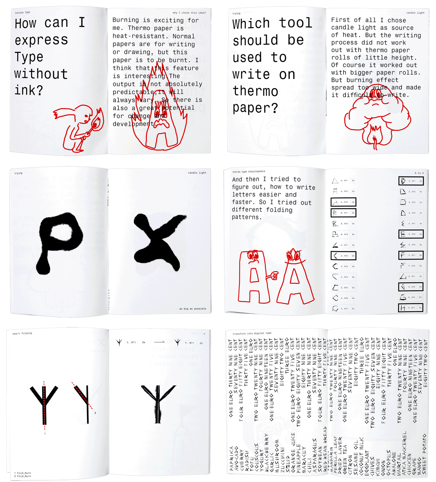
Thermo Type – Typeface series drawn on heat-resistant paper.
Done at a seminar by Benoît Bodhuin.
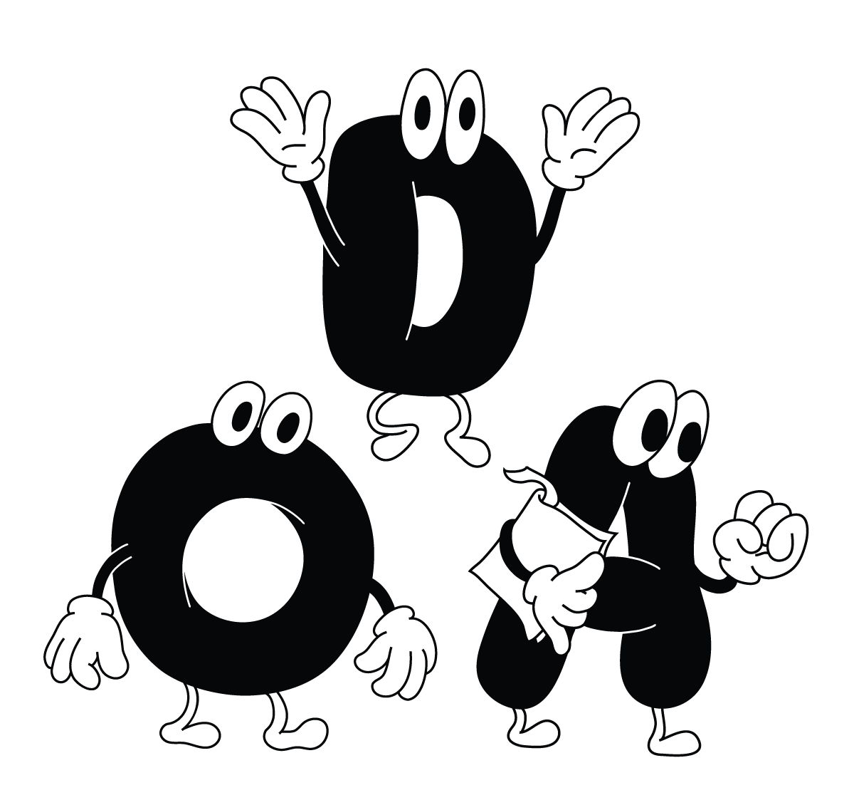
Alphabets in action.
moony “O”, pumped “D”, eager “A”
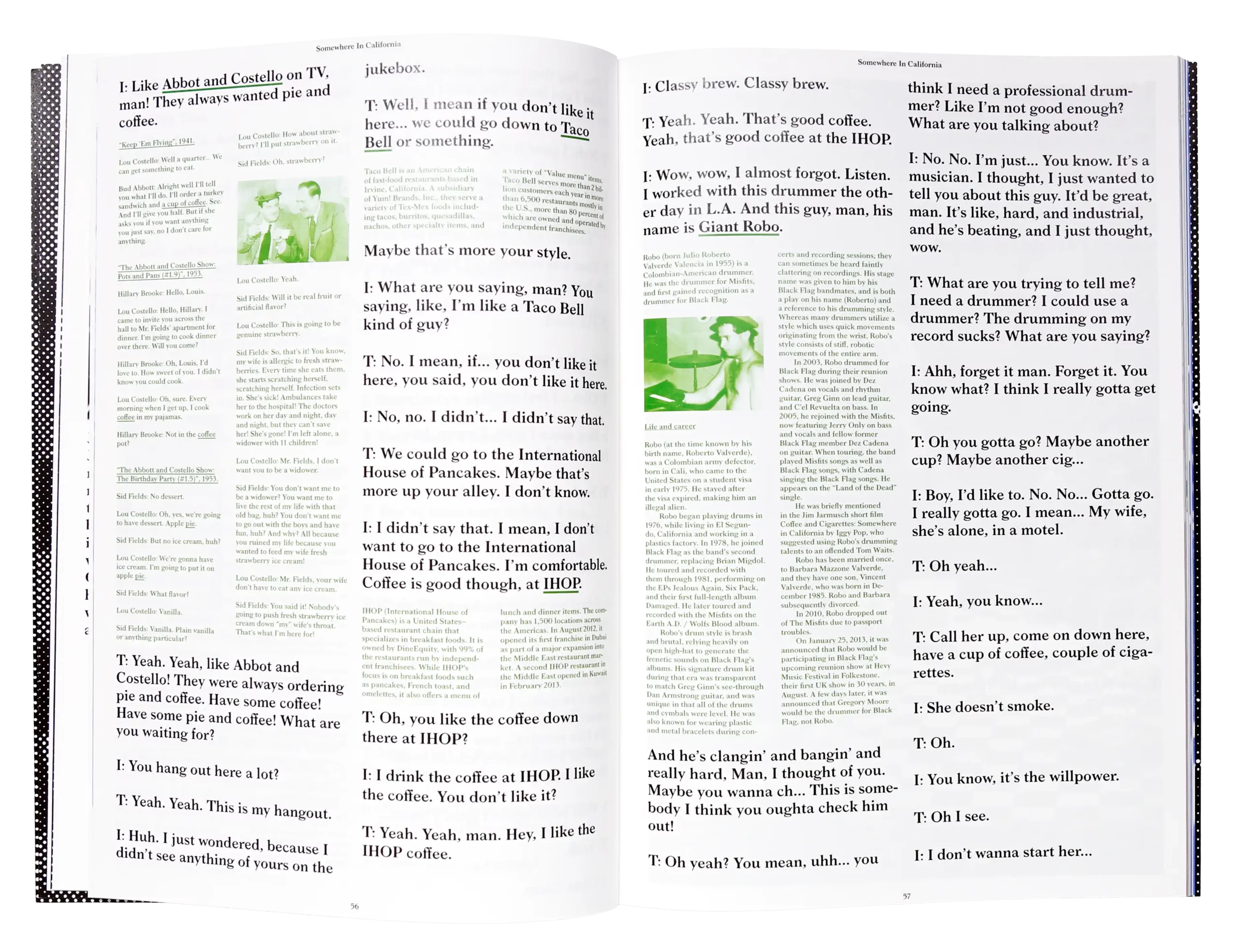
A publication about the film “Coffee and Cigarettes,” resulting from the seminar by Phillippe Karrer.
